
Dashboards are a critical part of FP&A, as they are the critical method in providing data visualization. However, not all finance departments are proficient in the best practices in creating dashboards, nor do all understand what the best resources available for dashboarding are, and how to properly use those tools.
Any finance team can acquire a serious competitive edge by cultivating a proper understanding of how to maximize their dashboarding; doing this involves understanding how to maximize visual appeal of these reports, improving organization, and balancing the use of older tools most finance professionals are the most consistently comfortable with, while adapting to the latest technologies in FP&A.
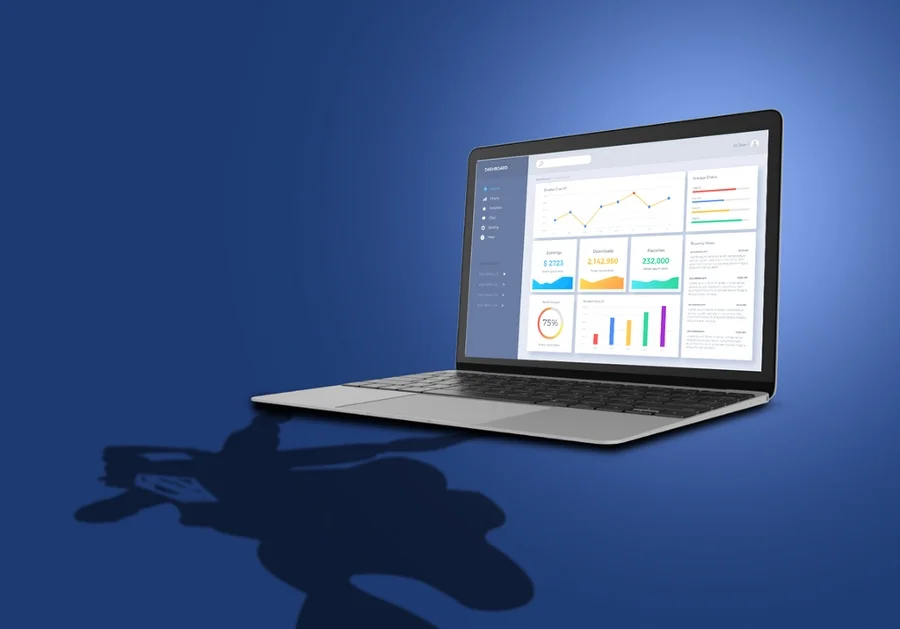
Example Excel Dashboard Template:

Defining Dashboards & Their Significance
Dashboards present information regarding metrics or KPIs as graphs, gauges, or charts, so that those who need the information can take a quick glance at a single screen rather than creating spreadsheets based on data gathered from multiple sources. Because visual data is usually more quickly and easily interpreted, dashboards are a critical tool for monitoring and tracking data for a business.
Dashboard reporting also allows you to track metrics and data imperative to the company’s bottom line and the customer’s success. Many Managed Service Providers (MSPs) spend too much time each week compiling their data into meaningful reports (meaning up to 10 hours per week). This can spell out an entire workday wasted on toggling between windows, logging into multiple accounts, pulling data into a spreadsheet, and then analyzing that data to find any indicators or trends which drive decisions. Fortunately, dashboard reporting provides a solution; the process of gathering data is automated, making it an easy and efficient way to save a lot of time.
Perhaps an even stronger argument for dashboard reporting is the effect it can have on internal and external relationships; it paves the way for a company’s transparency. When an organization can come clean and report on actual data, this establishes both reliability and credibility, especially when those reports are delivered consistently.
A dashboard report also professionally displays a clear report of your business. For example: if your MSP is responsible for your client’s 25 endpoints, every week, you may share with your client a dashboard report showing the patch status of each endpoint, which machines are set to expire soon, and how many threats were prevented the previous week. This is effective in proving your value as a partner while keeping the client looped in on their investments.
Regardless of the metrics chosen for a dashboard report, its main purpose is enabling you to focus on priorities, while strengthening the basis of client and team relationships. This means dashboard reporting can add value to a business of any size or industry. Just like any other business dashboard, financial dashboards meld the precision of data with the beauty of data visualization. One of the many benefits of data visualization is that it allows users to chart their organization’s performance, while also highlighting hidden correlations between seemingly unrelated metrics.
Best Practices in Dashboarding
1. Focus on the user experience
Try to remove the “middleman” of having to read and actively comprehend information – especially numbers. By focusing on removing as much mental work for your users as possible, you’ll be one step closer to creating a dashboard that accomplishes its end-goal.
2. Simplify Your Dashboard
It is critical to first consider your audience when making dashboards. A financial dashboard is typically not only by your finance team but also by executive leadership outside the office of the CFO, who often are not proficient in every minute detail of finance and accounting. Here are some ways to simplify your dashboard:
- Make the key takeaways clear and concise for end users.
- Ensure the clarity of headers and access titles.
- Create a high-level dashboard with essential KPIs for the C-suite. Managers and decision makers just need a summary of the company’s financial data. Everyone from C-suite leadership to sales and marketing should be able to take one look at your dashboard and immediately understand the key takeaways.
3. Organize your data
Raw data represents the key ingredient to an informative financial dashboard. Without clean, accurate data, your dashboard will be unreliable and riddled with errors. So before you even begin thinking about your dashboard design and layout, you must have your data ready and organized. Data with errors means dashboards with errors. Here are some examples of ways to keep your data clean:
- Make sure to sort your data before charting it.
- Check your formulas for any errors or issues.
- Review your number formatting (decimals vs. percentages vs. currency)
4. Making the Dashboard Dynamic
Users should be able to navigate through and play with your dashboard. This keeps others engaged with the data, and thus improves their ability to understand your data set. Key statistics and calculations should be easy to locate from the dashboard sheet, and the overall design should be able to handle a bit of interaction and activity.
5. Capitalize on Visual Appeal
The easiest way to create a simple dashboard is to focus on an effective design. Hide any unnecessary data and calculations that detract from your data visualization. You can do this by designing the structure of your dashboard around four categories:
- Data sources: These sheets will contain raw data.
- Reference tables: These sheets will hold the conversion rules between raw data and calculated columns.
- Pivot Tables: These sheets will help you analyze and summarize your data.
- The dashboard: This should be a single sheet that you use solely for data visualization and wowing your colleagues.
Furthermore, it is important to keep these categories separate. This way, the dashboard sheet can stand on its own without giving the eyesore of raw data and calculations. If something is not absolutely crucial for showing the main idea, it should be left out. A focus on aesthetics and design goes a long way; the non-finance workers in a company might even begin to enjoy receiving financial reports.
The Future of Dashboarding
For decades, Excel has proven to be an effective tool in financial analytics and analysis; anyone can create effective dashboards with this application. However, in the era of digitization, new tools have dramatically improved the efficiency and potential value of data insights. Among these new resources is FP&A software, which enables finance departments to share documents that can be updated in real time and accessed by key members of the team.
Doing this helps prevent multiple versions of the same document from being created as well as disparate information and feedback. Keeping a dashboard up to date like this is the only way to ensure its relevance continues; it’s important for dashboards to be as automated as possible. This frees the finance team up from managing manual data dumps and re-keying so they can focus on using the information in the dashboard to drive the business instead. Finance professionals that want their organizations to remain relevant must adapt to the technological developments in their field, and seize this competitive advantage.


