
Finance executives devote too much time to chasing waterfalls. Whether you’re creating a simple financial waterfall chart to illustrate data for your business partners or a cohort-based waterfall model, the process can be difficult, time-consuming, and laborious. Learn the ins and outs of creating waterfall charts – and how modern finance software can help.
What is a Waterfall Chart?
A financial waterfall chart, sometimes known as a cascade chart, is a visual tool that displays the alterations (positive or negative) in value between a starting value and an end value.
Regardless of the use case, the left-most column in a waterfall chart is the starting value, the right-most column is the ending value, and each of the floating columns in between shows how positive and negative values impact the ending balance.
These intermediate columns are often divided into smaller categories to provide a deeper understanding of the various factors that influence the changes over time.

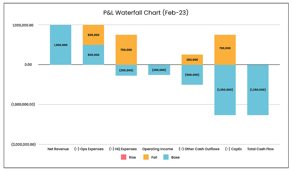
Example of a profit and loss financial waterfall chart
Waterfall charts are widely utilized in financial reporting as a visual representation of the changes in key performance indicators over a specific time frame, such as monthly, quarterly, or annually. The standard waterfall format is versatile and can be applied to various scenarios, such as analyzing annual recurring revenue growth, cash consumption analysis, and sales funnel analysis.
How to Create a Waterfall Chart
The procedure for creating a financial waterfall chart remains consistent regardless of the scenario. If you prefer using a spreadsheet, both Excel and Google Sheets provide the option to create a “Stacked Column Chart” that facilitates formatting the waterfall stages based on the data table.
Let’s consider a typical Annual Recurring Revenue (ARR) bridge as an example. To create the waterfall chart, you have to assemble a table with columns for Starting ARR, New ARR, Expansion ARR, Churn ARR, and Ending ARR. Then, add additional columns for Base, Fall, Rise, and Change values. The resulting table should look similar to this:

Example of a data table for an ARR waterfall chart
Then, insert a stacked column chart or bar chart into the spreadsheet, and specify the data ranges as the various table columns. Designate the first column as the X-axis to distinguish the stages, and add different series for the Base, Fall, Rise, and Change columns. The Y-axis displays the corresponding dollar amounts from the table.
In Excel, you can modify the formatting of a waterfall chart to suit your business needs using the following customization options:
- Chart titles
- Format data series as necessary
- Connector lines
- Section headers
- Options like adding running totals to bars
- Data labels
- Formatting for negative numbers

Example of a revenue waterfall chart
The illustration above demonstrates how the horizontal axis separates the changes in ARR and the vertical axis shows the accumulated total ARR. The chart starts with $1 million in ARR and increases due to the positive values of new deals, reactivations, and upsells. Meanwhile, negative values of churn and downsells reduce the total, resulting in an ending value of $1.25 million.
The Benefits of Using Waterfall Charts
The benefits of using waterfall charts are that they allow you to analyze performance trends in different and more granular ways. This provides finance and business leaders with new insights about how to improve corporate performance that they otherwise wouldn’t have had access to.
Cohorting data for forecasts and visualizing it with standard financial waterfall charts helps you add more strategic value to the business.
- Understand performance drivers over time. Demonstrate the performance of various cohorts over time, which can connect strategic decisions to their specific business consequences and guide future business planning.
- Optimize revenue, retention, and cash flow. Utilize waterfall analysis to monitor quarterly revenue targets, reevaluate payment conditions and discounts, and implement and assess the effectiveness of new retention approaches.
- Align with business stakeholders on the numbers. Generate visualizations that are easily understandable for non-financial stakeholders. A waterfall chart effectively showcases opportunities and disparities in the data, allowing you and your colleagues to focus on strategizing rather than clarifying the figures.
- Explain changes in the numbers. Easily identify fluctuations in your data from one period to the next. A waterfall chart highlights these changes, enabling you to thoroughly examine your finances, detect unusual activity, and take proactive measures to resolve any issues.
- Highlight seasonality in the business. Demonstrate how key metrics, such as revenue growth, evolve over time. The visibility of how the baseline changes from one period to the next helps you comprehend seasonal trends in the business, enabling more accurate forecasting in the future.
The advantages of creating waterfall charts make it a valuable effort, however, there is a limit to their usefulness. If the time invested in constructing the chart or model results in outdated analysis, the insights will become irrelevant and ineffective for the rest of the company.
The Problem with Building Waterfall Charts in Excel
Modern finance leaders often acknowledge that while spreadsheets are effective and adaptable for finance processes, they also come with their share of difficulties.
As Sal Abdulla stated in an episode of The Role Forward, “While spreadsheets are useful for analysis and ad hoc purposes, they are not suitable as databases or integration tools.”
Although creating occasional, ad hoc financial waterfall charts in spreadsheets may be feasible, relying on spreadsheets becomes more challenging when building complex waterfall models. In this scenario, a significant amount of time is spent extracting data from source systems, consolidating it into a model, and constructing intricate formulas, leaving little time for uncovering the strategic insights that could drive business growth.
But even if you’re just building out a simple waterfall chart, there’s the potential for issues in a spreadsheet. Your spreadsheet-based waterfalls are:
- Prone to human error. Whenever formulas and data are manually inputted into a spreadsheet, there is a risk of errors and typos that can lead to incorrect numbers or even cause the entire model to fail.
- Poor collaboration tools. Stakeholders in a business may comprehend a waterfall chart created in a spreadsheet, but the limitations become apparent when they cannot drill deeper into the data or add comments with ease. This hinders opportunities to enhance collaboration across the business.
- Unable to meet real-time demands. The extensive time required to gather the financial and operational data needed for spreadsheet-based waterfalls makes it challenging to keep up with the demands of the business. Automating data aggregation and using real-time data are significant reasons to steer away from spreadsheets for creating waterfall charts and models.
The limitations of spreadsheets are not novel, they have been present since the inception of spreadsheets and are not unique to the creation of waterfall charts in Microsoft Excel 2016.
Just because you have the capability to create waterfall charts in Excel does not necessarily mean it’s the most efficient way to present financial information. Modern finance software provides an alternative solution, making it simple to analyze the numbers, produce visually appealing charts, maintain stakeholder consensus, and automate the creation of waterfall models.


